We first met Hannah several years ago, when she was a hair stylist and had ended up managing the salon website on top of her normal job. She worked with us closely to redesign the salon site, and really understood how a strong online presence could translate in to real world results. Despite having no previous website experience, Hannah attended our handover WordPress training session and hasn’t looked back since! We always want our clients to feel confident managing their website after we hand it over, and Hannah’s story proves that you don’t need to have a background in coding to easily keep things up to date afterwards. If you can manage sending an email or typing up a letter, we can teach you how to stay on top of your website.
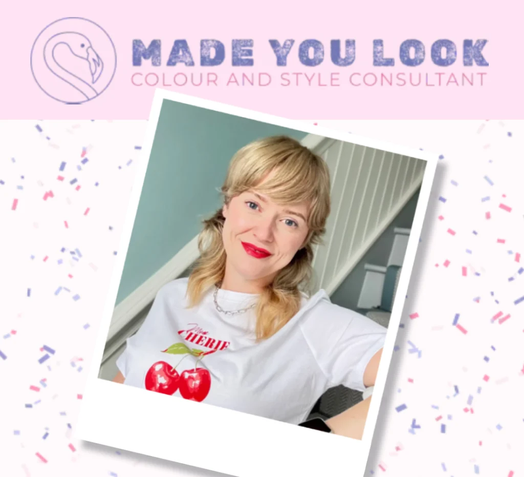
When Hannah contacted us to say she planned to start her own personal styling consultancy business, Made You Look Studio, we were delighted to work with her to develop her online presence right from the start.
Efficiency from Day One
We first discussed the project with Hannah several months before she officially started. This informal chat, alongside the WordPress training we’d previously provided, and Hannah’s experience of using the salon website to improve customer service, meant Hannah had a really good feel for how she could make use of online systems before she even began setting up her new business.
As a result, when we met for our first official project scoping session, Hannah knew how she would operate online bookings and gather pre-appointment information from clients, and had already set some of these systems up alongside new social media accounts for Made You Look Studio. Although she wasn’t ready to launch all her services yet, Hannah was also able to tell us about how she planned to develop her offer further. While it might seem a bit much to tell your web developer your full 5 year business plan, it was useful to know what other functions we might need to add to the website in the coming years. This meant we could ensure that whatever we built now was a good foundation for further expansion and could scale as Hannah grew the business.
Bringing the Brand to Life
At that first official meeting, we also discussed branding. Hannah already had a logo and a colour scheme in place, and we looked at some other sites that she felt worked well or had a similar feel to what she wanted from her site. It can be hard to verbalise and imagine how a site will look in the early stages of a project, so finding other items that appeal to you can be really useful. These don’t always have to be competitors; if you love the vibes on your local cafe’s website, or find the perfect font when renewing your insurance online, we can use that to develop a design that feels completely you.
The key thread running through the Made You Look Studio logo, Hannah’s existing social media posts for the business and the other sites we looked at was a bright and playful aesthetic, with layered colours, patterns and textures. We also discussed the values and audience of Made You Look Studio. The business is aimed mainly at women who feel like they have adopted a safe ‘uniform’ as the result of jobs, families or other responsibilities; it’s easy to chuck on the same thing everyday when rushing between the office, the school run, and the various other errands that need to be done. Made You Look Studio is about ‘rediscovering’ the client’s inner identity, and bringing that up to date with expert style advice and confidence-boosting tips.
From this, we developed a theme for the website layout that took inspiration from retro pinboards, secret teenage diaries and collaged scrapbooks. We wanted the layouts to be colourful and fun, and for visitors to be reminded of a time in their lives when clothing was more playful and they felt more inspired and able to experiment with their look. The main logo uses a font that looks ink-stamped, and Hannah was already using a handwriting-style font in her social media posts, so this further pushed the theme of a handmade personal style notebook rather than anything super slick or techie.

Our initial design combined hand-drawn decoration elements, images styled to look like cut outs or Polaroid photos, and layered patterns with curved blocks of colour. These fun and unique elements reflect Hannah’s personality, and feel familiar and understandable to her target audience. Layering the design elements over each other meant we could use background colours and patterns without worrying about legibility, as the body text can always have a plain background to give good contrast.
We shared this initial prototype with Hannah, and were able to adapt the design further in accordance with her feedback. This prototyping stage meant we could test out and refine the design idea quickly and easily, as we hadn’t wasted time building a full layout.
Functionality That Supports Real World Goals
At the same time as we developed the theme for the site, we also worked on the user journeys and page structure. Hannah had identified several ways she could bring people into the main funnel, so we needed to integrate all of these into the site layout and ensure that visitors clearly understood the different options.
- The main goal for the site was to bring in bookings; Hannah had already set up an online calendar with bookable appointments using Timely.
- Hannah had designed an online consultation form that captured some really key information; meaning she could reply with a truly personalised offer rather than a generic response.
- Hannah had also written a PDF with some of her top tips and a simplified DIY version of her process, which she wanted to include as a lead magnet.
- Finally, we needed to include a newsletter sign up form, as well as links to social media.

To make sure that the site would fully support these goals, we created a site architecture plan that outlined the main pages, then extensive wireframe designs that showed exactly what content and links would be on each page. This allowed us to see how visitors might move around the site, and how we could point them towards making a booking. The wireframes also acted as a ‘shopping list’ for content, so Hannah was able to use this to collect appropriate images and fill in any gaps in her written copy.
Adding Value
Personal styling is very much a real world experience, but we worked with Hannah to create digital service elements that elevate her offer over those of competitors. For example, Hannah had developed some pre-consult forms as part of her services. By collecting key information before the appointment, Hannah can properly prepare and make each visit really valuable for the client, and designing these elements to fit with the Made You Look Studio website makes it feel part of the whole experience for the client, not just another form they need to fill out.
While she could have done pre-consult forms on Timely, or with any online survey platform, integrating these into the website meant we could completely control how these forms appeared and when clients saw them. The online pre-consult forms were styled to perfectly match the rest of the site, something that is impossible on many survey platforms, and are hidden from crawlers and search engines so they won’t be seen by general visitors. Hannah was also able to link her Timely bookings to her mailing software, so each appointment triggered a mail sequence that welcomed the client, sent the pre-consult form at an appropriate time, and then guided the client on how to prepare for their upcoming session.
Although Hannah had planned out a lot of her marketing and funnel strategies, we were able to use our technical knowledge to make these work smoothly, meaning Hannah could concentrate on getting her message spot on. We used custom code to apply different tags to newsletter sign ups from different forms, and adjusted the mailing triggers to accurately allocate recipients to the correct welcome sequence.
Working With You To Grow Your Business
We wanted to share this project here as it demonstrates a lot of the ways we can help even the smallest or newest business develop their online presence and get real value out of their website.
- Hannah is a solo entrepreneur so has a lot of stuff to manage, as well as her core business of styling appointments with clients. Knowing the website was in safe hands meant she had one less thing to worry about.
- Although Hannah is confident running the website day-to-day and using digital marketing tools like mailing lists, having an expert to sense check ideas and troubleshoot anything that didn’t look right saved her wasting her time on things that definitely wouldn’t work, or endlessly trying out different solutions.
- Made You Look Studio had strong brand colours/fonts and it was clear what feelings the site needed to evoke. We loved being given almost free-rein within these guidelines to really push the design and create something that feels much more exciting, unique and interesting than many of the blocky and basic DIY designs of competitors. After all, promoting a styling service with a bland or uninspiring website just isn’t going to cut it.
- We’ve got the experience to build in SEO, advanced UX and the foundations for future services and functions all at the same time as creating the content design, page layouts and main user journeys. Hannah knew that investing in these basics from day one would save her time and money in the future, as the Made You Look Studio site is able to grow and scale as her business does.
If you’re currently developing a new business idea, or need your current website refreshed, we’d love to help make that process less stressful for you. Get in touch with us or book a free intro call to find out more.