Your website isn’t just about pretty colours and some nice pictures. It’s your most powerful marketing tool, working to find you sales even when you are asleep on or holiday. However, if visitors aren’t converting into leads or customers, it’s time to take a step back and evaluate what might be going wrong.
We frequently see clients who seem to have good traffic, but sales don’t reflect that. In this scenario, the culprit is almost always a series of obstacles in the user journey. Users are coming into the sales funnel by visiting the site, but instead of being guided towards your desired outcome, they are getting lost, becoming frustrated or confused, or just giving up and using a competitor instead.
Let’s look at 5 key areas to check if you want to improve your lead funnel, boost conversions and turn more clicks into customers.
Clarity
Starting with the first one: clarity. What does your site actually say? When someone lands on your homepage, you only have a few seconds to make an impression. Ask yourself:
- Can a new visitor quickly understand what you offer?
- Is it obvious who your target audience is (B2B, B2C, luxury, budget-conscious, a certain geographical area etc.)?
- Do you highlight why you’re different from competitors?
Your content should be clear, concise, and customer-focused. Don’t add too much jargon or fluff. If someone can scan your homepage for 30 seconds and still not know what you do, you’re losing business. You can read our blog on basic web design to get more tips if you think this is a problem.
Call To Actions
The next key area is the calls-to-action or CTAs. The best websites don’t leave users guessing what to do or where to click next. Strong calls-to-action (CTAs) guide visitors toward the next step, whether that’s booking a consultation, requesting a quote, or making a purchase.

Get a friend to try out your UX on a few different devices and give you some feedback. You could also take a look at these questions below:
- Are the main buttons or links easy to find on desktop and mobile?
- Is the text action-oriented and clear? (e.g., “Get Started” vs. “Submit”)
- Do users get stuck or confused navigating your menu?
- Does your site load quickly, or do visitors get bored and leave before they even see your offer?
Even small tweaks like moving a button higher on the page, making it a brighter colour or simplifying your menu can have a big impact on conversions.
Functionality
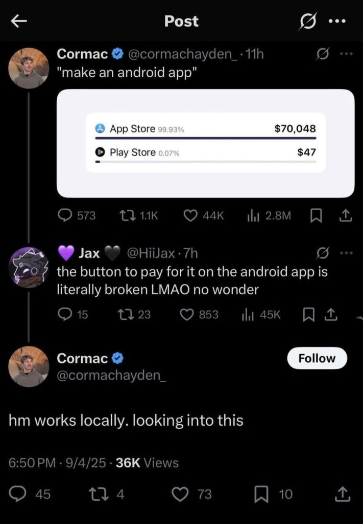
This is a surprisingly common issue that is really tricky to identify; does your site actually work? You might have found your site has plenty of good CTAs, but what happens when you click on them? Do they lead to the right place, or is the link broken? Is the button too small to click on a mobile?
Again, the best way to find out about any functionality problems with your site is to get some friends to test the site, ideally using different devices and browsers. When we’re testing a site we’ve built, we often find things like the site is perfect on an iPad, but things don’t display properly on an Android phone. Maybe a form works well in Chrome, but isn’t clickable in Firefox. You can also identify some of these issues through web analytics; do users who convert have the same technical profile as all users?

Most users won’t bother to tell you if your site is broken, so any unusual analytics or sudden drops in conversion are well worth investigating further.
Reputation
Area three is very important: building trust. We need to give users proof you’re the real deal. In a world full of choices, and constant worry about scams, visitors need reasons to believe you. Here are some ideas to make your site feel more trustworthy, which could make all the difference.
- Testimonials from happy clients
- Case studies that showcase real results
- Reviews from trusted platforms like Google or Trustpilot
- Logos of companies you’ve worked with
- Any guarantee schemes, regulatory body membership or professional certifications you hold.
Trust-building isn’t optional, it’s essential. If people don’t feel confident you can deliver what you promise, they won’t convert.
Search Optimisation
And last but certainly not least: SEO. We’ve already established that you have good traffic, but are the right people finding you? Even the best-designed website won’t convert if the users aren’t the right audience. As a web developer, I’m never going to be in the market to buy a commercial aircraft, no matter how great the website is. That’s where fine-tuning your SEO comes in.
When trying to improve your SEO, ask yourself:
- Are you using the same keywords as your audience is searching for?
- Could you target smaller (but more likely to convert) groups of customers with long-tail/very specific phrases?
- Do your meta titles, featured images and descriptions make people want to click?
- Are you creating content that solves problems your ideal customers face?
The better your SEO reflects your site, the more relevant traffic you’ll attract, and that means better quality opportunities to convert visitors to sales.
If you need more help figuring out why your website isn’t creating real-world results for you, we’d love to help. We can examine your analytics, UX, and SEO to pinpoint exactly where visitors are dropping off and what’s preventing them from converting. If you’d like a professional evaluation of your website, book a free intro call or send us a message to get started.


